Hallo,
about two weeks ago I received the X-ray data (it takes 3-4 weeks until that is fully processed at the ESA data center). I have started with the analysis and I will post a few pictures below, so you get an idea what the X-rays look like. So far, I did not compare that to the optical spectra, but I will do that.
Also, I am still waiting for some of the optical photometry that people from the AAVSO might have taken. Most likely I'll do the full scientific analysis and and publication some time in autumn.
First, I want to show you some bits of SU Aur.
Here is the lightcurve:

In the first panel I show the X-ray lightcurve. As you can see, SU Aur is mostly constant except for a flare in the end. In previous observations it did flare more often, but we never know that in advance. There is a high chance of flaring, but that does not mean that it actually happens. In the middle of the observations there is a short time period (which I marked in red) when the background (mostly from solar energetic protons) is so high, that the detector saturated.
The second panel shows the hardness ratio. A higher number here means a hotter plasma. There is some low scale variability until the temperature rises in the very end in the flare. As last panel I show optical photometry from the AASVO (that is easier to show on a plot than your spectra), but unfortunately the flare is not covered (but there might still be people submitting observations later).
Not to bore you with lightcurves too much, here is a spectrum:

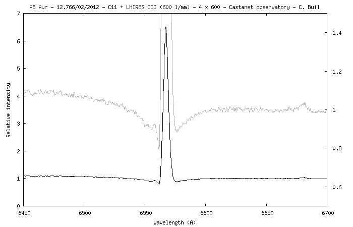
This shows the X-ray spectrum of AB Aur (SU Aur is hotter, but does not look too different). On the x-axis I plot the photon energy (higher energy = lower wavelength, 1keV = 1.24 nm), on the y-axis the count rate. This is a low-resolution spectrum. Really, the spectrum consists of mostly lines with very little continuum, but the resolution is so low (R = ca. 10) that all lines blend together and make it look like a continuum. Fortunately, we know the energy of the lines we expect, so we can still compare the strength of e.g. oxygen and neon lines, but I have not done that yet.
Errorbars show the noise on every single data point. That is due to the low number of photons (each point contains only 15 photons!). You may notice, that the y-axis is in units of "counts". In X-ray astronomy we generally do not show spectra in units of flux (as you do in the optical), but in a way that allows us to basically read off the number of photons directly form the plot.
The next steps for me are to reduce the X-ray high-resolution (R=500) spectrum, fut that with an accretion model and determine the mass accretion rate form the optical spectra you took.
Thanks so much for your help again.
I'll keep you updated on my progress.
Moritz